Hi, this is Benni, honored to be your host this week. Wandering around the neighborhood of my winter home, I am struck by the different style of buildings in "Old Venice" and that is how I decided on the theme of architecture. Mine are mostly houses, but yours might be anything from a cathedral to a cottage or even something very unusual.
Wonderful banner shot by Belita. A wonderful capture of a truly memorable face.
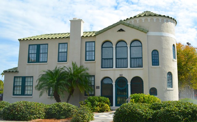
The Triangle Inn, a Venice, Florida landmark from the 1920's
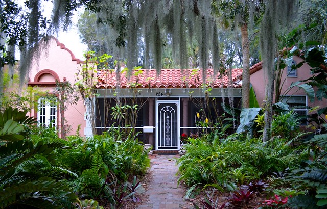
Mediterranean style, with Spanish moss and a jungle feel
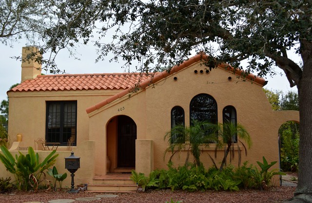
A smaller cottage, also from the 1920's
A change of pace, the Board of Water and Light building in Lansing, Michigan. Completed in 1940, the bricks are dark on the bottom and gradually getting lighter in hue so that the building is reminiscent of a flame.


Great theme Benni
ReplyDeleteDelightful house
Beautiful garden and wonderful facade
Terrific shot
Impressive edifice
Hi Benni a great theme and four fabulous shots to get us started I really like them all but second shot really draws my eye ;)
ReplyDeletei like this theme very much.
ReplyDeleteThe first photo is pure nostalgia and I love it
The second and third are also very good examples of the style in which they were built
I have seen the fourth before, but it always manages to fascinate me with the shades of colour on the bricks.
The Triangle Inn is very pretty! I love the green tiles and I especially love the placement of the two palms, there.
ReplyDeleteohhh, I would love to have a front yard that looked like that. So lush! I love the Spanish moss.. it gives the foreground of your photo a lovely canopy feel.
Really cute cottage!
Love the dark to light bricks in the last building. Very unique!
hi bennie, impressive buildings. my fav is the second one maybe because it reminds me of spain a nation I love
ReplyDeleteHi Benni !! Thanks for hosting this week, a great theme!! I love all three of the Venice shots, particularly the first and third ones. The second one not so much. Maybe it's the Spanish moss, but there's something slightly creepy about the place. LOL. I remember final shot from another theme long ago. I really like that flame-effect colouring.
ReplyDeleteThanks all for your kind comments. I'm so glad your enjoyed the theme and my pictures.
ReplyDeleteHi Benni! Four excellent shots of different architectural designs The bottom one pictures a very impressive building, both in colour, dimension and design. It's my favourite...
ReplyDeleteThanks for your words regarding the banner shot...