Congratulations, Randall! what a beautiful banner!
The top three photos were taken today (Lisbon)
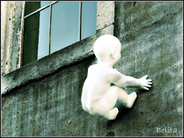
WHITE BABY CRAWLING UP THE FAÇADE OF AN INTERIOR DESIGN STORE
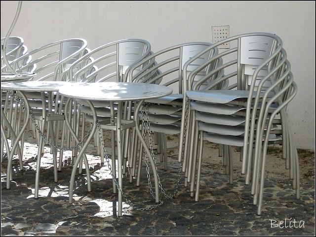
GREY CHAIRS AND TABLES
BLACK GRAFFITI - A SKATER BOY
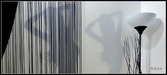
WHITE, GREY AND BLACK


Wow! These are great shots and I don't know what more I can say, but of course I want to try. The baby (I assume plaster or some such) is amazing. Also very whimsical and a great ad for an interior design store. How better to for the designers of the shop to announce their creativity? Wonderful lines in the chairs and splendid graffiti. My favorite, so stunning, is the collection of lines and curves in the bottom photograph. Fabulous, Belita!
ReplyDeleteHi Belita!! Great takes for this week's theme, I like that you've taken a different view on the subject matter by placing the white/grey/blacks within colour shots. That baby climbing the wall is really eye-catching!! Definately an attention-grabber!! The shot of the tables and chairs is perfect to show grey as the main colour. The black graffitti is also very good....it looks very big....like it takes up a large part of the side of the building. The 'double shadow' in the final shot is very intriguing!! And the lines on the left-hand side remind me of a bar-code.
ReplyDeleteDelightful piece of modern art
ReplyDeleteVery cool design
"Yippie-dee-doo-daah!"
Wonderful composition
Ha ha I like the white doll on the side of the building. Very good. The chairs are out of the box, but cool in the color of gray. I like the darkness of the silhouette of the skateboarder. and the last with a lighter silhouette.
ReplyDeleteSomething completely different. Love the baby climbing the wall as well as the skater, lovely use of the b/w theme. the stripes in the last one almost look like a bar code, very good effect.
ReplyDeleteHow unusual...the baby on the wall!
ReplyDeleteI like the silver gray tables and chairs. The stones of the pavement make a striking contrast to their sleek, smooth design.
Nice shots, all of them. I love the skateboarder. Looks like Banksy's work.
What a unique shadow you captured.
Thanks all for the kind comments!
ReplyDeleteYou're welcome, Belita.
Delete